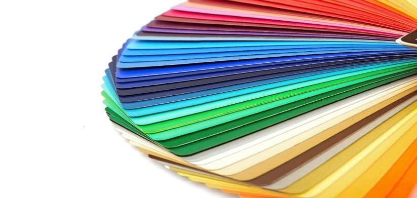
A logo is an important aspect to any company. It serves as the visual image of the company’s products, philosophies, brand, and identity. The connotation of the logo varies, depending on the company itself, such as: loyalty, creativity, trustworthy, innovation, or luxury.
Take for example Apple: evolving from the multi-colored striped apple to the now sleek and silver apple shows an increase in technology and practicality. However, with the mix of design and PR, the logo becomes a symbol of innovation and brand loyalty. When it comes to technology, many consumers refuse to buy any other brand than Apple.
With the combination of the different associated meanings with the bitten apple, color plays a critical role. Not only does the choice of color palette affect the cost of printing and image resizing but it also has a psychology behind it. Would the Apple logo still have the same connotation if Steve Jobs did not want to change the look? The fact is different colors evoke different emotions.
When Infinity Concepts designed the logo for Gregory Dickow Ministries, the color blue was chosen. The white cross wrapped around the stylized blue globe symbolizes the embrace of the overwhelming love of God. White signifies peace and truthfulness, whereas, blue signifies dignity and trustworthiness. The combination of the colors and the design carries a deeper meaning of the love of God covering the earth. Would the same meaning be portrayed if the logo was designed with different colors?
Colors Evoke Emotions
Because different colors do imply a variety of emotions, the products, philosophies, brand, and identity of the company must be researched and carefully measured. For instance, because gray is a neutral color it tends to suggest practicality and stableness, whereas, green implies tranquility and health. The choice of color can greatly affect the success of a logo and how it portrays a company’s image. If the wrong color is chosen, the consumer will associate the company with the wrong meaning; therefore, the logo would be ineffective.
-
-
-
-
- WHITE: cleanliness, peace, purity, innocence
- YELLOW: happiness, sunshine, caution, cowardice
- RED: adventure, passion, energy, danger
- BLUE: loyalty, confidence, authority, trustworthy
- BROWN: calmness, natural, serious, utility
- BLACK: classic, formality, mystery, serious
-
-
-
The Bottom Line
The color of a logo should not merely be chosen on instinct or favoritism but rather due to the emotions that colors produce. Because different colors do imply a variety of emotions, it is important that the products, philosophies, brand, and identity of the company be carefully researched. As a form of non-verbal communication, color has the ability to convey meaning within design.
- Evangelicals in the Public Arena: 36% of American Evangelicals Say They Not Are Politically Conservative - March 12, 2024
- The Spiritual Journey: 72% of American Evangelicals Came to Faith Before Adulthood - January 23, 2024
- New Research Offers Fresh Insights in Fundraising Ad Design: Use of Scripture and Watchdog Charity Ratings Impact Response - December 5, 2023

