
I am on a quest to minimize. Interestingly, I have been on this quest for many years, and just when I think I have reached a point when my accumulated stack of stuff has been conquered and cleared out, another one seems to take its place. This ritual cleansing takes me on an inward journey each time, and the one constant is that I must challenge what is truly important in my life and what I can—and often times must—let go.
This journey is a painful one at times, because we are hardwired to maximize use of space. We naturally succumb to the temptation to fill these open spaces with more stuff and nurture the deception that it contributes to our happiness and ultimate good.
In creation, we observe space everywhere. We experience it. We share it. We are in awe of it. Space creates tension and mood, and it can establish boundaries. The space between notes creates a covalent bond between music and emotion. Even our own inner, desperate cries for space reveal the human need for solitude as a way to soothe and ease life’s challenges.
In Star Trek, space is the “final frontier.” More abstractly, space is a philosophy that when honored and utilized, creates depth, balance, and harmony.
As a designer, space is my friend, but it can be frequently overlooked and/or disregarded by those who do not fully comprehend its purpose and its power. Some believe that white space is wasted space. Not only is this belief untrue, it also has the power to damage your audience’s perception of you as a business or organization.
What is white space in design?
In any design, whether it is digital or print, white space is the unused area between elements. White space can be found in borders, between lines of text, letters, photos, and graphic elements, to name a few. White space does not need to be white; it only needs to create negative space between elements on a page or screen.
White space is most effective when used strategically. While design theory holds that white space is a tool to evoke quality and elegance, it also helps to balance design elements and organize content for the benefit of the user.
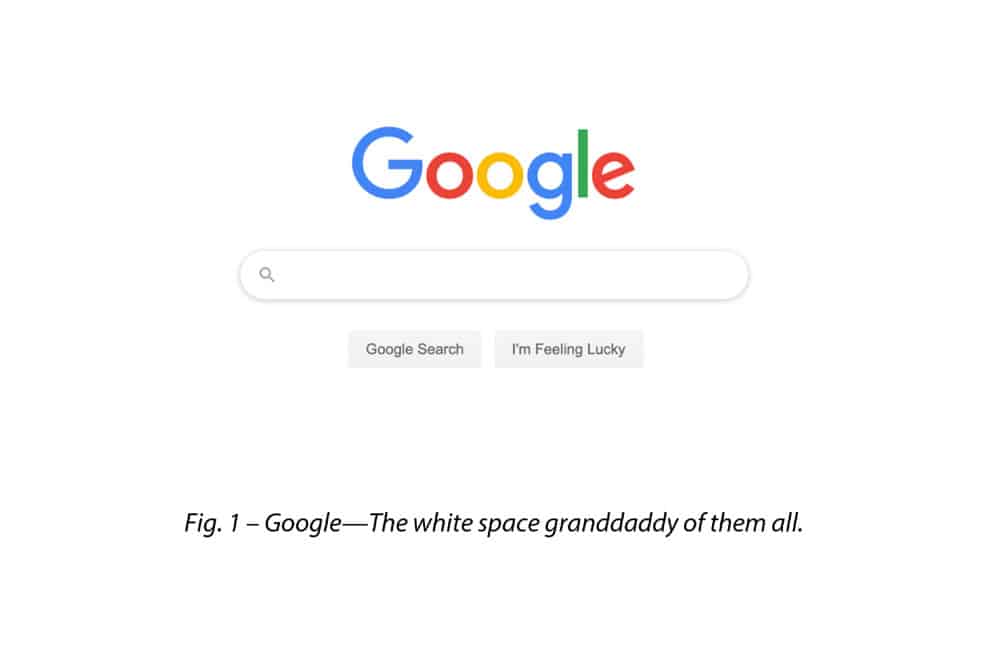
Most people experience information overload on an almost daily basis. In order to quell the deluge of information, white space can make a user’s experience with a design easier to digest, allowing it to breathe. Google exemplifies the strategic use of white space to maximize the user experience. Simple and clean, Google remains among the most widely used search engines on the market, and it has designed its entire toolkit around this concept. Even their parent company name, Alphabet, suggests simplicity and calm.
Not all white space is created equal.
A few variables come into play when deciding when, where, and how to employ white space in your design. Designers must take certain ratios and proportions of micro and macro white space into account when forming a design.
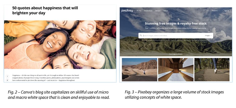
In short, micro white space (see Fig. 2) pertains to the area between small areas of a design, particularly letters and lines of text. It can impact legibility, reading speed, and comprehension.
Macro white space (see Fig. 3) incorporates the overall design with a particular focus on its major elements—more specifically, those elements that are not primarily text-based.
Layouts will incorporate various degrees of both micro and macro white space depending on the following factors:
- Volume of information
- Target audience
Brand message
White space has a major influence on your overall design.
Making use of white space can be the determining factor in how your audience responds. A cluttered page that lacks organization and direction will not likely hold user attention for very long.
White space, when employed in a user-centric way, will help you reap benefits when it comes to helping your audience understand your brand, and building a bond of trust. Audiences will deliberately interact with large volumes of content if it is easy to navigate, explained clearly, and helps to guide users along the way.
Step back and take a hard look at your content. Is your audience responding the way you want them to? If not, then perhaps the solution is as simple as giving them space to breathe.
If you want to take your creative projects to the next level, reach out to Infinity Concepts!
CLICK HERE or call us today at 724.733.1200.

- Discover Your True Colors in Two Easy Steps - December 11, 2020
- Discover Your True Voice - October 30, 2020
- 3 Things You May Not Know About Graphic Design - September 4, 2020
