There is a common trait often shared among successful businesses and organizations: their logos are usually simple, unique, and widely recognizable.
Logo design trends are constantly evolving. They are never one-size-fits-all. And when it comes to your logo, it can be tempting to stick with “Old Faithful” rather than to put a new—and perhaps costly—spin on it. If you believe your logo continues to resonate with your audience and effectively reflects the essence of your brand, then it might be best not to mess with a good thing.
But for many businesses and organizations, the challenge to identify audience preferences and changes in market trends while maintaining a strong brand can be daunting. More than ever, logos are a powerful and important means towards establishing a firm connection with your audience, while helping you to differentiate from your competition. A logo refresh comes with implications, but it can also demonstrate your willingness to be relevant as well as to communicate to your audience that you are in touch with their needs and what made them fall in love with you in the first place.
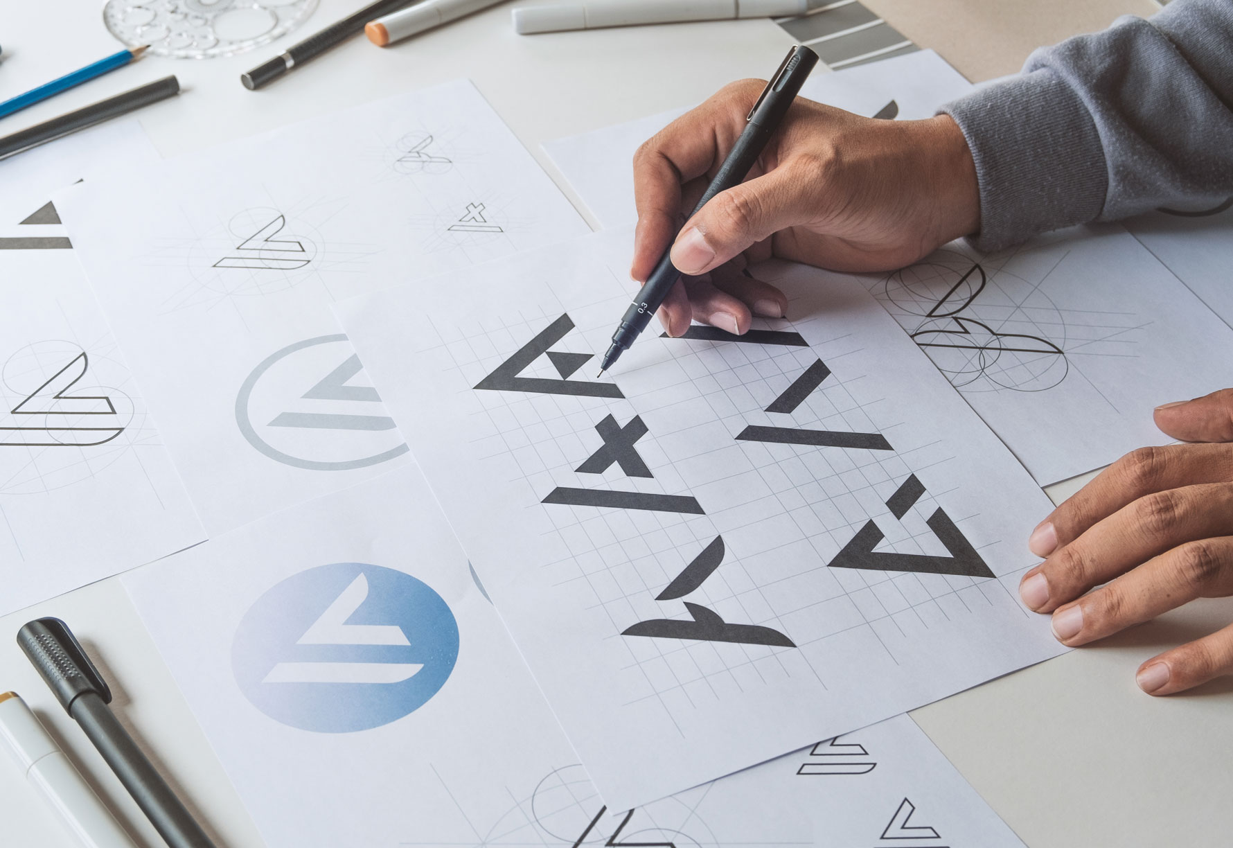
If you are contemplating a logo redesign, you might consider a minimalist approach. The minimalist aesthetic has been in existence since the 1960s, during a time when artists eschewed more conventional artistic techniques and introduced a movement that focused on eliminating overly complex elements of a design, allowing space and simplicity to give it meaning.
Some of the most famous and widely recognized logos in the world, such as McDonald’s, Netflix, Ford, Apple, Nike, and many others, incorporated minimalism into their designs.
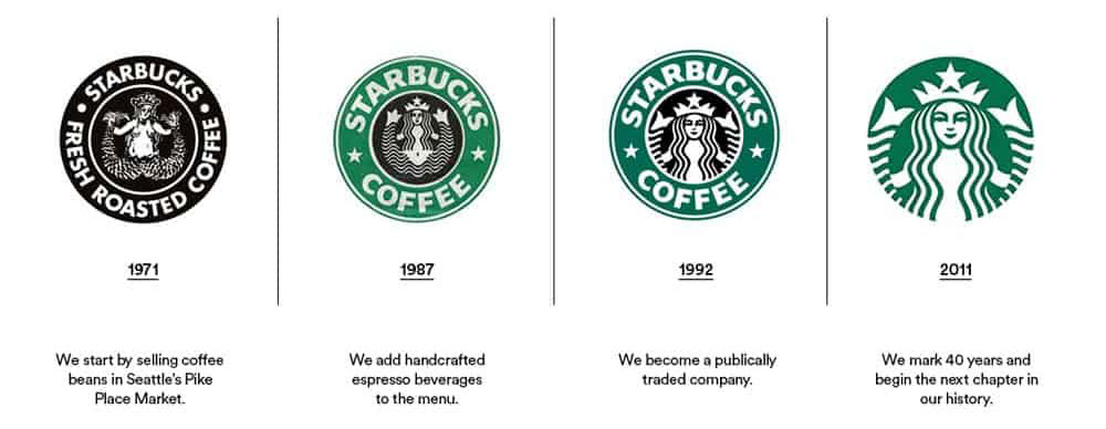
One of the most famous rebranding campaigns was in 2011, when Starbucks unveiled a minimalist approach to their iconic logo.

Starbucks knew what they did well—selling coffee throughout the world—but they were ready to explore new territory that involved products beyond their flagship product. The change ushered in ice cream, a ready-to-drink product line, fresh food, etc. And while the change was met with some resistance by Starbucks faithful, it was ultimately well-received and kept Starbucks at the top of the coffee market.
Leonardo da Vinci famously quipped, “Simplicity is the ultimate form of sophistication.” This idea is time-tested in logo design. Look around. Larger companies, and even small businesses and organizations have scaled back, introducing clean lines, and simple shapes and colors. Complex logos become the victim of recall and often lose the staying power they once had.
It is vitally important to note that not all minimalist designs are the same. There are many sub-trends from line art, to flat designs, and logos which introduce gradients. A skilled graphic designer can advise you on the most effective approach to a redesign. The ultimate goal is to provide you with a logo that is not only practical, but emblematic of the heart of your business or organization. Minimalist logos are cost-efficient and translate well across a variety of platforms.
Is it time for a refresh? Do you want to give your brand more staying power? A new logo may be the ticket! CLICK HERE or call us today at 724.733.1200.
- Discover Your True Colors in Two Easy Steps - December 11, 2020
- Discover Your True Voice - October 30, 2020
- 3 Things You May Not Know About Graphic Design - September 4, 2020

